30 Captivating Google Web Fonts for Businesses in 2020

Contents
- 1. Open Sans
- 2. Lato
- 3. Source Sans Pro
- 4. Montserrat
- 5. Roboto
- 6. Merriweather
- 7. Nunito
- 8. Work Sans
- 9. Oswald
- 10. Spectral
- 11. PT Sans
- 12. Lora
- 13. Concert One
- 14. Abril Fatface
- 15. Fira Sans
- 16. Fjalla One
- 17. Playfair Display
- 18. Georgia
- 19. Myriad Pro
- 20. Muli
- 21. Poppins
- 22. Rubik
- 23. Rokkitt
- 24. GT Walsheim
- 25. Josefin Sans
- 26. Archivo
- 27. Slabo
- 28. Cardo
- 29. Noto Sans
- 30. Karla
Did you know that typography is one of the intricate details in web design that could have a significant impact on your website?
As trivial as it sounds, choosing the right font for your website can have an impact on your web traffic and conversion rates. The right font design has a somewhat ‘magical’ power of making your website more appealing and enhancing the user’s experience.
Most businesses overlook design details such as the typography when it comes to their website.
Our web and UI designers will ensure that the typography of your website not only retains users but also works to reflect the essence of your brand. We work with you to provide a bespoke solution that is tailored to your brand.
With that being said, we’ve rounded up 30 of the most captivating Google web fonts for your brand to consider in 2020. Whether you’re looking for a font that’s fun and quirky or something that’s sharp and professional, there just may be some Google web fonts here to better represent your brand.
1. Open Sans
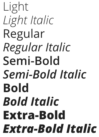
Image: Google Fonts
Open Sans is one of the most popular Google web fonts. It is currently featured on more than 25 million websites. Created by designer Steve Matteson, Open Sans is a free sans-serif font that can be used in virtually any scenario since it’s optimised for print, web and mobile interfaces.
Benefits
– Elegant, sophisticated, very modern – Designed with an upright stress, making it simple, professional, neutral, clean and very friendly – Exceptional reading experience as it is attractively readable and legible – Typographic range that includes non-Latin characters such as Greek and Cyrillic accents and more
Popular Pairings
– Roboto – Oswald – Lato – Raleway
Our Recommendation We recommend the use of Open Sans when looking for a standard feeling. Consider using it on corporate, company and product websites.
2. Lato

Image: Google Fonts
Designed by Warsaw-based designer Lukasz Dziedzic, Lato is arguably the most interesting sans-serif web font for 2019. It’s designed to include 10 different styles ranging from thin to ultra-bold. Lato is currently used on 12 million websites.
Benefits
– Unique curves in characters that bring a warm feeling – Very modest and unassuming – Transparent when used in body text – Sleek and reverberates with most of the current trends – Warmth, stability and seriousness
Popular Pairings
– Roboto – Oswald – Open Sans – Montserrat – Raleway
Our Recommendation
Lato is generally a corporate Google web font that looks very professional. It’s quite transparent and can be used either for corporate and normal websites.
3. Source Sans Pro

Image: Google Fonts
Designed by Paul D. Hunt and released by Adobe, Source Sans Pro draws inspiration from early 20th century gothic such as New Gothics and Franklin Gothic. Although it’s a little reminiscent of FF Meta humanist sans-serif, it feels much modern. It includes 12 different styles ranging from extra-light to black italic and comes both in upright and italic styles.
Benefits
– 12 different styles for various purposes – Exciting and professional font – Great User Interface (UI) which allows it to be used in print, web and mobile – Highly legible
Popular Pairings
– Lato – Roboto – Raleway – Oswald
Our Recommendation
It’s simple yet unassuming design makes it highly attractive particularly if you’re looking for a more classical typography. It’s perfect if you’re looking for a subtle, deep yet sophisticated web identity.
4. Montserrat

Image: Google Fonts
Created by Julieta Ulanovsky and named after the Buenos Aires neighbourhood of Montserrat, this font is literally meant to “rescue the beauty presented by urban typography”. The idea here is to ensure that urban typography remains as it was in the first half of the 20th century, long before the web was a thing.
Benefits
– Shines on a website – Letters are simplistic and comes in nice large heights – More characters than Helvetica and Arial – Montserrat is designed to automatically detect the type of device being used by visitors and respond accordingly
Popular Pairings
– Roboto – Open Sans – PT Serif – Lato – Esteban – Georgia – Tinos – Gill Sans
Our Recommendation
Montserrat will give your website a majestic yet fun looking feel. Consider using 16px for content and 30px for headers.
5. Roboto
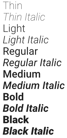
Image: Google Fonts
Designed by Christian Robertson, Roboto is the official font for Google’s Android and Chrome Operating System. As you can imagine, Roboto is simple and highly readable both on the web and mobile interfaces. With more than 26 million websites, it’s one of the most popular fonts.
Benefits
– Modern, emotional yet approachable font that’s very friendly – Allows letters to settle in their natural width giving readers a more natural reading rhythm – 12 variants from thin to ultra-bold making it very versatile
Popular Pairings
– Lato – Montserrat – Raleway – Oswald – Open Sans
Our Recommendation
As Google’s in-house font, you can be sure that Roboto is professional, smart, clean and very user-friendly. It’s a familiar font for most web users even though it still has some unique characteristics.
6. Merriweather

Image: Google Fonts
Designed by Eben Sorkin, Merriweather is a sans-serif font for on-screen reading. With 3.5 million websites using Merriweather, it’s certainly not one of the most popular Google fonts, but it’s still one of the most pleasant fonts to read on screens.
Benefits
– Excellent legibility – Easily harmonises the weights and style of your content – Versatile with 8 various styles from light to bold italic
Popular Pairings
– Roboto – Lato – Oswald – Montserrat – Open Sans
Our Recommendation
You can use Merriweather when creating content that will be generally read on mobile devices.
7. Nunito
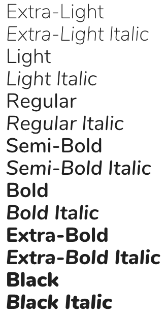
Image: Google Fonts
Designed by Vernon Adam, Nunito is a sans-serif font structured basically as a display font. Available in 14 different variants, it’s not so popular with website owners as it only attracts 670k websites.
Benefits
– Attractive and versatile that can bring a perfect balance to a website – It comes with rounded terminals that make it easy to read
Popular Pairings
– Open Sans – Oswald – Roboto – Montserrat – Lato
Our Recommendation
Nunito is a smart, stylish and readable font that can be used to create an elegant sans-serif heading. Consider using it when you want to tell a story that provokes emotion.
8. Work Sans

Image: Google Fonts
Available in 9 different styles, Work Sans is a loosely distorted font that’s designed for optimised on-screen medium-sized text usage. Designed by Wei Huang, Work Sans draws inspiration from the 20th century and can be used for different display purposes.
Benefits
– Versatile with 9 different variants – Features that are simple and optimised for all screen resolutions
Popular Pairings
– Raleway – Lato – Montserrat – Roboto – Oswald
Our Recommendation
Given its loosely grotesque nature, you can use Work Sans on basically every part of your website. You don’t have to worry about the display part of it, it will work marvelously both on a computer screen or a mobile device.
9. Oswald

Image: Google Fonts
This is a recreation of the classic early 20th century typeface family. Designed by Vernon Adam, Oswald is a classic Alternate Gothic font that’s redesigned for digital use on computers and mobile devices.
Benefits
– Works best for quotes and titles in limited spaces – Can be freely used across various devices
Popular Pairings
– Open Sans – Merriweather – Roboto – Arial
Our Recommendation
This is a font that perfectly suits both professional and informal writing.
10. Spectral

Image: Google Fonts
Available in 14 styles, Spectral is one of the newest Google serif face fonts. While it’s primarily intended for the screen-first scenario, text-rich and lengthy readings, Spectral is so versatile and can be used in any form of a web project.
Benefits
– Does not look distorted like other fonts – Unique and functional – Designed for immersive reading
Popular Pairings
– Raleway – Roboto – Open Sans – Crimson Text – Lato
Our Recommendation
This is an unobtrusive font that’s solid and already proven for its versatility. You can use it on various web projects, thanks to its resourcefulness.
11. PT Sans

Image: Google Fonts
Efficient for universal use, PT Sans comes in 4 styles ranging from regular to bold. This is a standard computer font that’s perfect for documents in a conservative environment.
Benefits
– Perfectly combines both traditional and modern designs to enhance its legibility – It comes in 4 different styles to enhance its usefulness – Used for business applications as well as in urban visual communications – Multilingual typeface that supports many languages including Greek, Hebrew, Latin, Cyrillic, Armenian, Hebrew, Georgian and Armenian
Popular Pairings
– Raleway – Lato – Roboto – PT Serif – Open Sans
Our Recommendation
This is a universal font that can work well in various languages.
12. Lora

Image: Google Fonts
This is a perfectly balanced modern serif that draws inspiration from calligraphy. This is a font that’s not only suited for body text but with a very memorable appearance. Its moderate contrast and brushed curves are designed to convey a perfect mood of a contemporary website story.
Benefits
– High readability – Optimised font that is well-suited for a screen appearance – Versatile – Great in print
Popular Pairings
– Lato – Roboto – Montserrat – Raleway – Open Sans
Our Recommendation
This is a modern font that is perfect for telling a modern-day story or for writing an art essay.
13. Concert One

Image: Google Fonts
Drawing inspiration from 19th century 3D lettering, Concert One is a smooth-edged font that’s available in various options including normal, bold, italic, extra bold and many more.
Benefits
– Its uniqueness makes it a great option
Popular Pairings
– Open Sans – Lato – Roboto – Montserrat – Oswald
Our Recommendation
This is a great font that works well if you’re looking for uniqueness.
14. Abril Fatface

Image: Google Fonts
Abril Fatface is one of the biggest family typefaces. It is based on heavy titling fonts that were used to advertise posters in the 19th century. This font is not only neutral but also has a strong presence.
Benefits
– Clean curves that give it a refined touch and elegant appearance – A very neutral font that provides a strong presence
Popular Pairings
– Oswald – Roboto – Open Sans – Lato – Raleway
Our Recommendation
Abril Fatface is a neutral and strong font that can perfectly attract your reader’s attention. It has nice curves and high contrast.
15. Fira Sans

Image: Google Fonts
Designed for Firefox Operating System, Fira Sans is a humanist sans-serif font that’s closely related to Meta typeface. It comes in 18 styles that correspond with italics ranging from regular, light, medium and bold.
Benefits
– High legibility – Very versatile in a wide range of styles – Works well on various devices including desktop and mobile
Popular Pairings
– Montseerat – Roboto – Open Sans – Raleway – Lato
Our Recommendation
It can be integrated into just about any type of website both formal and informal.
16. Fjalla One

Image: Google Fonts
This is a medium contrast display sans-serif font that can be used in a wide range of sizes and screen resolutions. This font is carefully designed with clear and bold features to give it a lean yet strong outlook.
Benefits
– Great legibility – High-impact font that has good looks and fresh displays – Bold and designed with simplicity
Popular Pairings
– Lato – Source Sans Pro – Open Sans – Roboto – Raleway
Our Recommendation
You can consider using Fjalla One in creating short paragraphs at moderate point sizes.
17. Playfair Display

Image: Google Fonts
This is an open-source serif designed by Danish designer Claus Eggers Sorensen. This typeface draws inspiration from the late 18th century art but with high-contrast stokes that gives it a more modern look.
Benefits
– Excellent for titles and headlines – Long stretches and high-contrast stokes
Popular Pairings
– Georgia – Montserrat – Raleway – Roboto
Our Recommendation
While it’s a great font for headlines, Playfair Display can hinder legibility if used in small sizes.
18. Georgia
As one of the oldest fonts on this list, Georgia is a serif typeface designed in 1993 as an elegant legible font that works great for low-resolution screens. It draws inspiration from 19th century Scotch Roman layouts.
Benefits
– Classic typeface that works great for both large and small font sizes – Very readable – Excellent for content heavy websites
Popular Pairings
– Helvetica – Proxima Nova – Arial – Benton Sans – Lato
Our Recommendation
Georgia is an excellent font that works great if you are looking for something classy for your website.
19. Myriad Pro
Another classic typeface on this list, Myriad Pro was designed by Robert Slimbach and Carol Twombly in 1992. This humanist sans-serif typeface is a distinguished font that is best known for its usage by Apple Inc.
Benefits
– Excellent font for informal websites – Fine-tuned and user-friendly in print, desktop and mobile devices
Popular Pairings
– Museo Slab – Chaparral Pro – Adobe Caslon – Roboto – Montserrat
Our Recommendation
This font is great for a website with heavy content.
20. Muli

Image: Google Fonts
This is a minimalist sans-serif typeface that is perfect when used as a show font. However, its adaptability makes it a great option as you can also use it as a text font. You can use it across various platforms including computers and mobile devices.
Benefits
– Highly versatile – Designed to be a display font – Excellent as a text font thanks to its perfect spacing
Popular Pairings
– Oswald – Ubuntu – Fjalla One �– Raleway – Roboto – Open Sans
Our Recommendation
Muli is a great font both for personal and commercial use.
21. Poppins
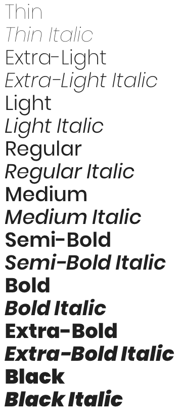
Image: Google Fonts
Created by the Indian Type Foundry, Poppins is a geometric sans-serif font that’s attractive and can be used both as a text or display font. It is a multilingual font that is perfect for both print and digital media.
Benefits
– Multipurpose font that’s easily editable – Can be used as a display or text font – Available in 18 variants for versatility – Has multilingual features that makes it great for use in various languages
Popular Pairings
– Playfair Display – Lato – Raleway – Roboto – Oswald
Our Recommendation
This is a universal font that is excellent for just about any type of website.
22. Rubik

Image: Google Fonts
Designed by Philipp Hubert and Sebastian Fischer, Rubik is a sans-serif font that draws inspiration from the Hebrew style of writing. Available in 10 variants, Rubik is designed with rounded corners that give it a pleasant and friendly look.
Benefits
– Has a pleasant and friendly look – Can tremendously improve the appearance of your website – Helps balance the overall look of your website
Popular Pairings
– Roboto – Montserrat – Raleway – Lato – Open Sans
Our Recommendation
If you’re getting tired of using common fonts such as Open Sans and Roboto, Rubik can be a nice option.
23. Rokkitt

Image: Google Fonts
Drawing inspiration from geometric slab serif fonts that were hugely popular in the late 1800s and early 1900s, Rokkitt is very perfect for displaying headings as well as on body text.
Benefits
– Excellent font that can improve readability – Strong horizontally to improve the high-contrast of your website – Fashionable font – Reinforces the legibility of your text
Popular Pairings
– Open Sans – Lato – Ubuntu – PT Sans – Oswald
Our Recommendation
This is a unique font that is fabulous in creating both text-based and image-based websites. You can also use it for displaying headings and headlines.
24. GT Walsheim
Drawing inspiration from the lettering of legendary Swiss poster designer Otto Baumberger from the 1930s, GT Walsheim is the creation of Noel Leu. It’s available in four variants ranging from medium to ultra-bold.
Benefits
– Very charming geometric font – Perfect for visual communication – Has a contemporary feel, savvy and friendly look
Popular Pairings
– Karla – Adobe Caslon – Utopia – Freight Big – Pona – GT Pressura
Our Recommendation
This is a perfect font for creating visual communication and image text.
25. Josefin Sans
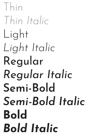
Image: Google Fonts
Designed with open round features, Josefin Sans is a very legible font that will be so useful to your readers. This is a geometric typeface that’s not only elegant but affords you a somewhat vintage look.
Benefits
– Great for its simplicity – Has 10 variants from thin to bold italic – The font reflects a good lifestyle and futuristic design
Popular Pairings
– Open Sans – Roboto – Montserrat – Raleway
Our Recommendation
Unlike many fonts on this list, this is a futuristic font that can be a great option if you’re looking for something unique.
26. Archivo

Image: Google Fonts
Designed with technical and aesthetic features, Archivo is perfect for both digital and print platforms. This is a typeface that’s designed for high-performance typography and can support over 200 languages.
Benefits
– Grotesque sans-serif typeface that was designed for headlines and highlights – Has a modern and fresh look
Popular Pairings
– Oswald – Montserrat – Open Sans – Roboto – Lato
Our Recommendation
Not a very popular font but it can be great if you’re looking for something inimitable.
27. Slabo

Image: Google Fonts
As a collection of size-specific fonts, Slabo is a great font for online advertising as well as other uses. It currently includes Slabo 13px and Slabo 27px. This is a fine-tuned font that can be used both for display and on text.
Benefits
– Used to increase the readability of your website – Versatile and perfect for various purposes – Good for headlines and texts
Popular Pairings
– Roboto – Montserrat – Open Sans – Oswald
Our Recommendation
Consider using it for advertisements on your website.
28. Cardo

Image: Google Fonts
An old-style serif font that’s designed with modern and sharp strokes. It’s designed for the needs of linguists, medievalists and Biblical scholars. Having been revived in modern times, it can give your website a classic but appealing look.
Benefits
– Great font suitable for scholars given its high legibility – Pretty font that’s appealing for all purposes
Popular Pairings
– Lora – Open Sans – Roboto – Lato – Raleway
Our Recommendation
Even though it’s a great font, we wouldn’t recommend it for headlines.
29. Noto Sans

Image: Google Fonts
Noto Sans is a unified set of open-source typeface that can be used for every written language. It is one of the largest typefaces and can effortlessly resonate with numbers, symbols and musical notations.
Benefits
– Promotes global communication as it is used in every available language – Has a harmonious look that makes it one of the most complete typefaces – Flexible as it supports all unicode
Popular Pairings
– Noto Serif – Montserrat – Gilroy – Museo Slab – Roboto
Our Recommendation
This font is a great way of connecting the digital community in a readable format.
30. Karla

Image: Google Fonts
Designed with some really nice quirks, Karla is a grotesque sans-serif typeface that’s available in regular, bold and italics. From the curve descenders to subtle features, this font is appealing from right down to body copy sizes.
Benefits
– Modernist font that perfectly supports various scripts – Best quirky grotesque typefaces – Has spacing that is a little wide
Popular Pairings
– Lora – Montserrat – Oswald – Roboto
Our Recommendation
The popularity of Karla is increasing dramatically because it’s one of the best free fonts around.
While the technical details of Google web fonts may sound insignificant, their importance on your website can never be downplayed. As a website owner, you should understand the power of using an appropriate font on your website. That’s because it plays a crucial role in the success of your website and your business in general.
We hope that you’ve gained a better understanding of web fonts. Choosing the right font design for your website is never easy. That is why it’s always a good idea to have an experienced web design agency by your side.
For more information about our web, social media monitoring or paid performance services, please contact us.
Our awards.



More brands that we’ve helped.


Featured insights from our team.
