Increasing digital engagement and donation revenue through a research-led UX approach
Web


We were engaged to transform the Barnardos Australia digital experience, with a sharpened focus on their donation portal. Initially, we ran a full-day stakeholder workshop which looked to better identify the website’s purpose and vision, and then specifically delve deeply into the current state, and the user personas and segments that exist.
The Challenge.
Following the session, we conducted our own research and developed:
User persona profiles
Research sheets
Current GA analysis
Competitor analysis
Site map
User flow maps
Our UX research provided some key insights:
Futility: When users see large numbers (e.g. 1,000 children will sleep without shelter tonight), they feel overwhelmed by the size of the issue and that their single contribution will not cause a difference;
The Identifiable Victim: Our research showed that we contribute more to a cause that has an identifiable victim. We feel more empathy when we hear the story of one particular individual, as opposed to being exposed to a broader issue;
Transparency: we feel more inclined to give when we understand transparently where our money is going.
Transaction attachment: Users are more likely to exit a donation flow if the payment details are inputted at the final step.


The Solution.
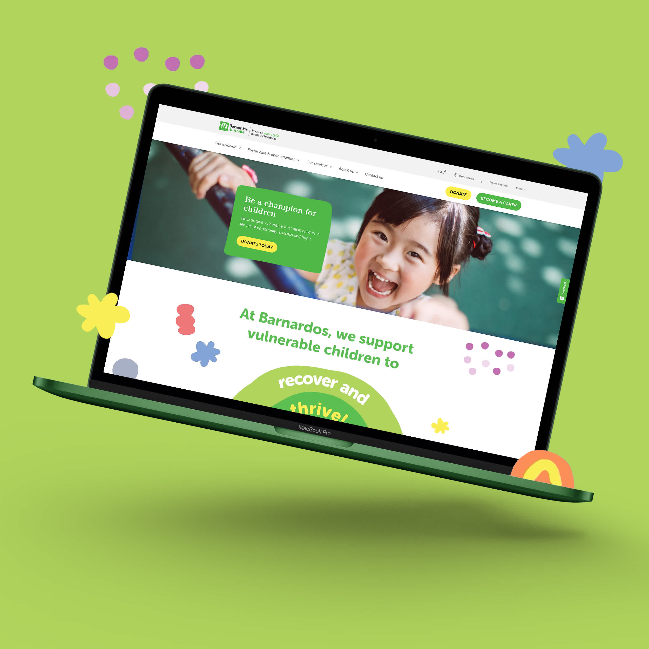
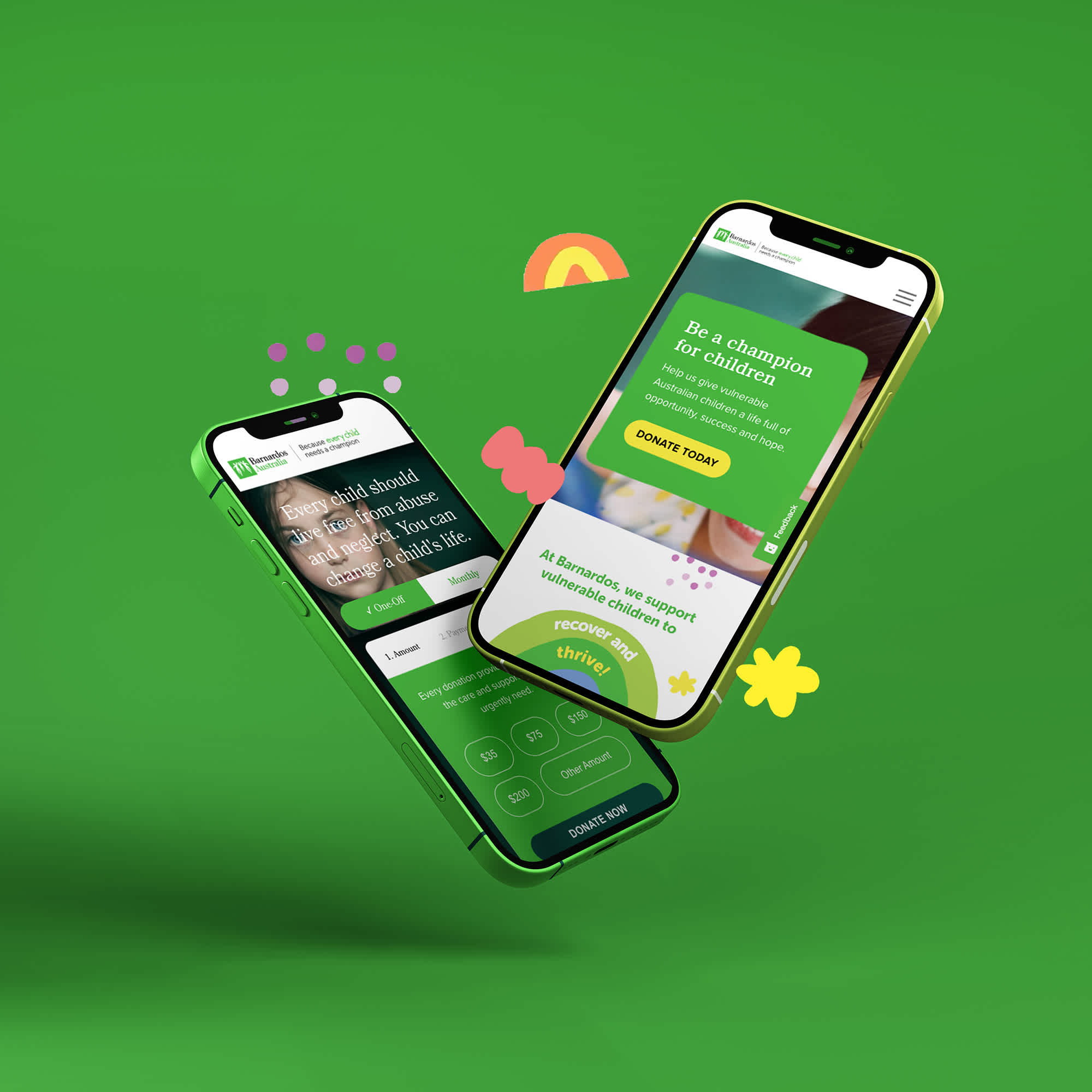
Following our extensive UX work, we then looked to overhaul the User Interface – and commenced by creating new blocks and elements to be the focal point of the look and feel. Specifically, we developed colourful and adjustable solid blocks that sit behind key messages and headlines – to move away from the corporate and serious tone of their previous UI. We also created engaging and interactive iconography. Once the UI approach was approved, we rolled it out across all pages – including the Donation and Carer portals. We consolidated their content-heavy pages and created seamless experiences that focused on the goals and objectives of the user personas we had developed. We also incorporated graphs and interactive diagrams to better display dense content and statistics.
The Results.
In terms of results, in the 6 months post launch the website has seen:
26% increase in donation revenue
47% increase in monthly/regular donation subscriptions
12% decrease in bounce rate.
More brands that we’ve helped.


Featured insights from our team.


